VODAFONE
Increasing checkout completions
Simplifying the checkout process for business users
MARKET
Portugal
PROJECT
Redesign project within the business checkout of the Vodafone Portugal site
TEAM
A team of 3 - 1x UX/UI designer, 1x Project Manager, 1x CRO Consultant
ROLE
Led the project and carried out majority of it from research to ideation, design and validation

Key project steps

What are we trying to solve?

A new checkout experience was launched by Vodafone for business users who purchase internet packages. Our focus for this redesign is to identify motivations to successfully complete the checkout and barriers which prevent checkout completion in the newly launched checkout.
IDENTIFY POTENTIAL SOLUTIONS
How do we gather data?
Analytics review
We used data captured from Google Analytics to understand user behaviour in the current checkout and which steps had the most friction or abandonment.
UX Review
I analysed the current checkout experience based on the Baymard Institute UX guidelines to help uncover any usability issues.
User Testing
A small sample of users reviewed the original checkout experience guided by targeted questions to understand how users found it and what the challenges with the current checkout were.
There was some positive feedback from users around the current checkout journey.
"It’s easy to use… the checkout process is pretty simple and straightforward."
However, our research uncovered some key issues that users are facing in the current experience.
IDENTIFY POTENTIAL SOLUTIONS
What are our key opportunities?
Using a behavioural indicator framework that focus on core branches of user persuasion, we identified that usability, comprehension, cost, trust and motivation were the main areas for us to focus on in the checkout. We can break these sections down further:
Usability

FUNCTIONALITY AND PRESENTATION OF FIELDS
The current version of the form fields could be modernised to improve their intuitiveness. Interaction with the different components on each step caused a lot of user frustration so simplifying how this works for users could prove impactful.
Leveraging the aesthetic-usability effect, by making the UI of the fields and more generally each step cleaner, we can reduce users anticipated effort.
The Baymard Institute UX Guidelines rank the usability of the checkout experience as 'poor'.
Several UX guidelines aren't adhered to such as users being unable to change pre-filled fields or having uninformative error messages show only once a CTA has been selected.

PROMOTING USER UNDERSTANDING
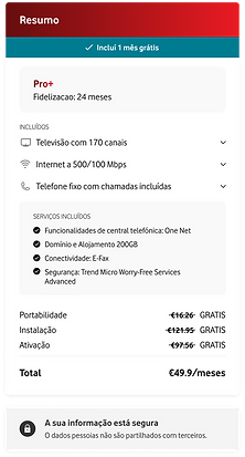
There is a lack of understanding from users around what is included in the order summary and there is also confusion in the terminology used for different sections in each step. Essentially, users are unsure what is being asked of them in the checkout and what they are receiving from this purchase. The payment section is also concealed behind a drop-down making it seem unimportant even though Vodafone would like more people to make a purchase online rather than on the phone.
Comprehension
"A lot of functionalities and a lot of names are jargon, or a fancy name (referring to product features)... it doesn’t explain to me what it is… There is a lot of language here that isn’t meant to be understood!"
"It didn’t feel like it was something about my purchase (referring to product summary)... I don’t really like it, it’s not obvious. It doesn’t say that it is my product summary. "
There is prominent click back behaviour on Step 1 (14%) and Step 2 (19.5%) of the funnel. This suggests users are navigating back in search of some information they can't find.

REDUCING EFFORT ASSOCIATED WITH EACH STEP
Users are experiencing a high level of anticipated effort in the current checkout journey. There is a lack of cohesion throughout the multi-step funnel and so grouping related sections together in individual steps should create a more natural user flow and reduce effort. Optional and required fields should also be highlighted. To further counteract the effort experienced, we can provide motivational CTA copy as a form of encouragement to continue through the flow.
Motivation
Previous A/B test that we have run showed a positive uplift of 3.7% on the conversion rate when the final CTA copy was changed to be more motivational.
"Maybe you shouldn’t be asking me for my [NIF, name of business] before checking if my coverage exists… This type of information should be inputted afterwards and not before."

TRANSPARENT COSTING AND PROMOTING OFFERS
There is user anxiety around hidden additional costs that aren't outlined in total price. This also includes how long the current cost of the internet package will last for. Users could deem the internet package they select as more valuable if they were aware of the additional offerings associated with the package, but currently this information is not clear to users.
Cost
"Does the service become more expensive? It doesn’t look like it would, but it’s not clear."
Only 1 user from user testing noticed the '1 month included' offer.

ADDING SECURITY REASSURANCES
Checkouts are often a high-anxiety area for users on a site. The recognised brand name of Vodafone helps to create a sense of trust on the site, but we can further this by providing additional justifications for personal information requests and including security related copy in the flow.
Trust
Previous A/B test that we have run showed a positive uplift of 12% on the conversion rate when we reassured users using security copy.
Seemingly uneccessary personal data like a phone number is required without a justification to users around what this data will be used for.
DESIGN AND VALIDATE SOLUTIONS
What solutions did we design?
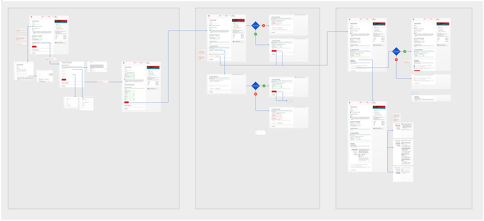
Based on the opportunities identified from our research, we proposed some recommendations to the client and then once we had sign-off I created wireframes of the revised checkout experience before having regular meetings with the client to review these. From there, I created the high-fidelity designs. I designed for desktop as this was the highest traffic device. The applications to mobile were considered during all of the design stages.


DESIGN AND VALIDATE SOLUTIONS
How did users respond?
We needed to validate the changes made using real users to identify whether we had created a simpler, more informative checkout that encouraged users to make a purchase in comparison to the existing checkout experience. We were especially keen to understand how likely users would now be to purchase online (rather than on the phone), whether users would understand the product offering more and find it more valuable than before and lastly whether the methods used to make the checkout experience less effortful would be reflected in the users feedback.
User testing looked to answer these 2 main questions:
-
Does the new prototype solve and alleviate the issues we uncovered?
-
How does the prototype compare to the current checkout experience?


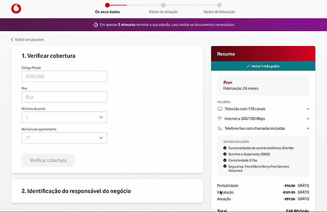
All users responded positively to the restructuring of the flow as there was no overlap between the business and individual detail related sections. Users also responded positively to having the coverage checker on the first step and expressed that it improved their commitment to continue through the checkout flow.
"Of course, having the coverage checker is relevant because I don't want to take the time for a service i don't have in my zone... i think it’s pretty important to have it at the beginning. "
6/10 users found value in having the features of the plan in more detail within the order summary. The contract duration, included services and one month free were the most important areas in the summary for these users.
"Having the plan on the right, what we are going to have, is pretty important so I don’t need to go back and forth... nothing is missing from it."


Some users felt that the process of inputting an address could be simplified even further. Users favoured input fields over drop-downs so we made this simple change to decrease user frustration on this step.
"What I don't like is the method of checking. Let me insert it [the number], I know my own number.'"
Overall, step 2 achieved our primary aim of making a simpler and more user friendly step. In control, users in step 2 displayed the most click back behaviour suggesting there was a lot of frustration on this step for users which we have counteracted with our changes made.
"I like how quick it was to fill it out and how user friendly it was to fill this out without being overwhelmed with information. "


9/10 users expressed that they would prefer to make the payment online rather than over the phone which highlights how users have little reservation around providing their details upfront. This was an area we were keen to improve to encourage more users to purchase online and the feedback we received seem to reflect that desired outcome.
"I would fill it out. I have no problems giving you the payment data because I know I can deactivate it and get my money back."
A surprising insight from user testing was that over half of our users were very engaged in the permissions content. This section was mostly unchanged in our redesign, but we realised after user testing that there was value in making the content easier for users to navigate through.
"If I was in charge of the contract then I would read through the permissions."

DESIGN AND VALIDATE SOLUTIONS
Final Prototype
We shared our findings from the user testing and made these final amends to the checkout flow. Vodafone were very confident in this revised checkout journey that we produced. We had a handover call with their internal development team and they have since implemented this new experience on the business internet packages area of their site whilst looking if they can also scale this over to the customer side of the site as well. This redesign prototyping project was able to validate a lot of the proposed solutions we uncovered during the initial research phase. Having two points of user testing to compare the control and variation checkout also helped to further solidify the variant as the optimal experience for users.
The final prototype was created using Figma

