TEARFUND
Promoting donation amount

Increase donations by £30,000 in 4 months
CLIENT
Tearfund. An international Christian charity with a primary focus on supporting those in poverty and providing disaster relief for disadvantaged communities.
TEAM
Cross functional team: 1x UX/UI Designer, 1 Project Manager, 1 CRO Consultant, 1x Front-end developer, 1x QA Engineer
ROLE
As the UX/UI designer in the team, I was focused on translating concepts into optimal design solutions and identifying additional opportunities for growth on the Tearfund site.
GOAL
A cumulative increase in donations of £30,000 in 4 months
MARKET
UK
What was our approach?
We were tasked with increasing donations by £30,000 within 4 months.
To do this, we ran a continuous A/B testing programme on the Tearfund UK site. The experiments conducted were based on UX research and data analytics to produce insights that fed into the hypotheses we were looking to prove during experimentation. We only had a short period of time to reach our target which is why we focused on 'quick wins' and experiments with minimum viable effort due to technical capacity.
- We built and launched at least 3 tests per month.
- Experiments were based on a tried-and-tested
behavioural framework called 'levers'.
Spoiler alert: We reached our goal! 🎉

Research & Strategy

An initial stage of research included a competitor analysis, exit-intent survey and post-donation survey to identify key motivations and barriers for users.
The observations we captured in our research were tied to broader insights which informed our concepts and design solutions.
*We store all of our research and insights in one centralised place in Airtable.
We grouped each of our insights by 'lever' which allowed us to give greater meaning to what our data was saying. These levers which represent key behavioural indicators include trust, cost, usability and motivation. From this, we could then break down these themes more granularly as you can see below. These more granular themes are what we based the experiment concepts and design solutions around. We tested each theme and based on the results iterated on it or abandoned it. This method allowed us to more efficiently find the most impactful experiments to run.

Out of all of the sub-levers that we tested within our timeframe, we proved that credibility and financial cost were the most impactful in increasing average donation value and the amount of donors.
HYPOTHESIS
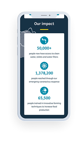
We hypothesised that leveraging credibility would increase the donation amount via impact statistics.
RESEARCH
This was based on research showing that transparency around how donations are used and what effect donations can have are motivational for users to donate.
-
Competitors like Save the children and others show impact statistics.
-
User testing participants were interested in the effect that Tearfund's work was having, but struggled to find it on the site.
-
We previously ran a test on another NGO client and looked at the effect of an impact-focused homepage in comparison to a problem-focused homepage. We saw an uplift of +22% in monthly donors and +18% uplift in one-off donors which further supports our hypothesis.

"It's the output, the work that gets done from that money that you donate, that's what interests me."

RESULTS
-
We increased revenue per visitor by 102% on mobile.
-
Desktop users saw a non-significant downward trend, driven by the decrease in conversion rate.
-
These findings suggest that showcasing impact via statistics can prove impactul, but the effect is determined greatly by the executions per device and so I wanted to explore alternative executions on desktop.

ITERATION
-
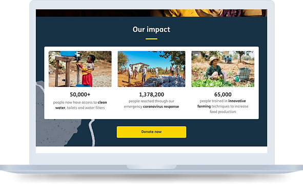
We introduced imagery to increase the module’s prominence and persuasiveness.
-
We also gave users a direct route to donate by adding a 'donate now' CTA in the section.
-
We increased revenue per visitor by 80% on desktop with this iteration.
-
Revenue per visitor decreased on mobile. This is likely due to the module being too long on mobile in comparison to the previous version.
CREDIBILITY: ANOTHER APPROACH
HYPOTHESIS
We hypothesised that leveraging credibility would increase the donation amount by optimising the spending module.
RESEARCH
-
User testing research highlighted the importance of where donations go.
"I really like the fact that they tell you where your money goes."
-
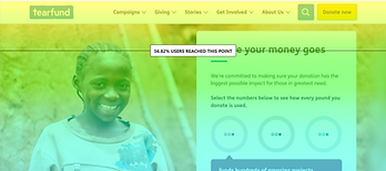
But, only 57%/38% (desktop/mobile) of users currently see this information.


-
The current spending module may be decreasing the perceived value of the donation by having three separate values.

DESIGN
-
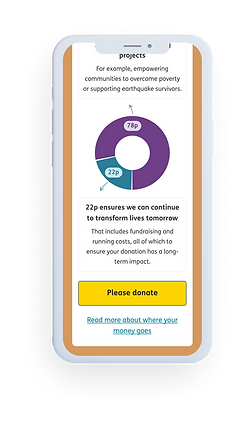
The spending module was moved up the page to sit just below the hero section.
-
We wanted to showcase all content upfront and therefore removed any interactive elements.
-
The pie chart layout was used as this is a clear way to convey the split of a pound.
-
We also gave users a direct route to donate by adding a 'donate now' CTA.


RESULTS
-
We increased the number of users donating by 22% on desktop.
-
The experience differed on mobile as the section was very long which might have contributed to the negative trend in revenue per visitor.
Next, we would want to consider an alternative execution of this on mobile devices. A smaller module might prove more impactful.
HYPOTHESIS
We believe optimising financial cost will have a positive impact on donations by reframing donation values.
RESEARCH
-
Survey research highlighted that cost was the key barrier to donating.
-
Users are hesitant to commit to a monthly donation and are more likely to make a one-off donation for financial control and affordability reasons.
-
We found that users are more willing to donate when the price is relatable. We previously ran a test on another client site where we reframed donation values to change the perceived cost and this increased donation conversions by 160%.

DESIGN
-
We reframed the donation values to show daily as well as monthly amounts.
-
Imagery was also included next to the donation impact description.
RESULTS
-
We increased the number of users donating by 20% on desktop. These desktop users were not likely to donate a higher value.
-
The changes made also resulted in a 38% reduction in average donation value on mobile. Mobile users were not deterred from donating, but were more likely to donate less.
-
We introduced both copy and imagery into a relatively dense area and doing so on a smaller screen may have been more overwhelming for users, hence the negative impact on mobile KPIs.

Next, we would want to consider an alternative execution of this on mobile devices where we minimise the space taken up in this module.
We designed solutions and A/B tested changes based on sub-levers and met our target of increasing donations by £30,000 in 4 months! 🎉
We found that social proof, positive feedback, value statements, effort and reassurance solutions proved less effective than credibility and financial cost in promoting average donation value and the amount of donors. Further iterations around improving the user flow, security reassurances and attention could be run as we believe these are still valuable areas to users.